The Art of IDGAF
Barbara Kruger Shows Supreme Where To Stick It
Disputes around copyright and authenticity are nothing new in the art world.
Adding to this age-old debate is streetwear and skateboard brand Supreme, a label coveted by Hypebeasts worldwide. In 2013, Supreme led a $10M lawsuit against fellow streetwear label, Married to the Mob. In this case, Supreme argued that their rival used what has become Supreme’s signature white lettering, superimposed on a red background to spell out “Supreme Bitch” on a Married to the Mob t-shirt- one of the label’s key pieces since 2004.

So, how does this argument between fashion brands link to some good ol’ art world drama?
While Supreme sued Married to the Mob over their branding, it is widely acknowledged that the Supreme branding itself resembles the lettering that conceptual artist Barbara Kruger uses throughout her influential body of work. These artworks, which Kruger began creating in the 1980s, far precede the Supreme brand, which was conceived in 1994.
Kruger’s artworks are characterised by her frequent use of white Futura Bold Italic, a typography first created by Paul Renner in 1927, enclosed in a bright red rectangle. Fashionistas will recognise this typography and red box as Supreme’s signature branding too.
The images below show some clear similarities between the lettering used by Kruger and Supreme. The first image is the the artist’s iconic 1989 work “Untitled (Your body is a battleground)” and the second is the Supreme branding, coined by its founder James Jebbia, in 1994.


What does differ from the norm in this case, is Kruger’s response to the legal dispute between Supreme and Married to the Mob. When she was approached by a journalist to comment on the lawsuit, the artist was straight to the point.
“What a ridiculous clusterfuck of totally uncool jokers. I make my work about this kind of sadly foolish farce. I’m waiting for all of them to sue me for copyright infringement.”, Kruger replied, as an attachment to a blank e-mail she sent the journalist.
But what does it all mean?
While visually similar, the use of text in Kruger’s work and in Supreme’s branding are different beasts. It has become key to both Kruger’s and Supreme’s visual identities but the backbone of this text is worlds apart.
Kruger’s works, though employing methods from advertising- often using ad images themselves as the backdrop of her works- are frequently deeply political. She uses her artworks as a vessel for critique, notably advancing a feminist discourse, questioning the consumerist mindset and forcing viewers to reconsider their everyday. For instance, the image above, “Untitled (your body is a battleground)” (1989) is formatted like a commercial advertisement, but created to advocate for abortion rights.
Supreme, on the other hand, capitalises on the branding aspect of this striking text more aggressively. Often superimposing it onto a plain item of clothing, like a white t-shirt, the white “Supreme” becomes a stand-alone consumerist icon: we buy it, because it is Supreme. And there’s more.
Supreme is also known for creating artificial scarcity with its stock, releasing a limited number of new items every week. So, the sweet spot between the brand association Supreme champions and the items’ perceived rarity leads fans to queue for hours outside shops for the newest releases. Items are then often resold for 20+ times their original value online, or tens of thousands of dollars. These items are essentially “flipped”, a common, yet closeted, art world practice that has been controversial in recent years.
Therefore, while Kruger’s work serves as a critique of our capitalist paradigms, the Supreme brand embodies them.


Nonetheless, he link between Supreme and Kruger isn’t just a tale of two opposites. Text- and its bold, brash presentation here- serves a similar purpose in Kruger’s work and Supreme’s logo: to grab viewers’ attention, to force a message, and to build a distinctive visual brand.
Though this is far from the first article to discuss the overlap between Barbara Kruger’s art and Supreme’s branding, the question remains- so what? One brilliant article by Jacob Victorine, Why Supreme’s (Mis)Appropriation of Barbara Kruger’s Art Matters More Than Ever, encompasses many of the issues here. What I want to investigate, however, is how an artist’s attitude on issues surrounding their work affect how we, as an audience, engage with and understand the debate.
The question of who owns what, and how each party could capitalise on the other’s success, was brought into the limelight with the Supreme- Married to the Mob lawsuit. Though it seems like the Supreme branding is a direct imitation of Kruger’s own style, she was never approached by the brand for permission to use the stylised writing and does not directly benefit from its profits herself.
However, based on her scathing reply to the Supreme lawsuit, Kruger apparently Gives No Fucks. Should we?
Discussions surrounding an artist’s agency in determining the meaning, and subsequent purpose of, their own artworks are divisive. Think of Georgia O’Keefe insisting that THOSE flower paintings have nothing to do with vaginas, and being repeatedly ignored to this day.
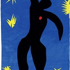
However, the fact that much of Kruger’s own art looks like an advertisement, or is even used for advertising purposes, blurs the boundaries between her art as a conceptual entity and a commodity in itself. See Kruger’s 2005 collaboration with Selfridges, below, for how her cynical pieces easily translate to marketing material.

Perhaps then, it is quite fitting that Kruger’s anti-institutional aesthetic is used at the core of a consumer capitalist brand like Supreme. It’s almost perfect in its irony and yet, through details like their attention-grabbing intent, the two aren’t so different after all. Plus, let’s be honest, aesthetically it looks pretty cool.
Therefore, though conversations around ownership and copyright in this case may never disappear, their boundaries start to blur, as both Barbara Kruger and Supreme become part of pop culture in their own right.
What does remain clear here though, is that sometimes, calling people “totally uncool jokers” is all that’s needed to perfect the art of IDGAF. Cheers Barbs.